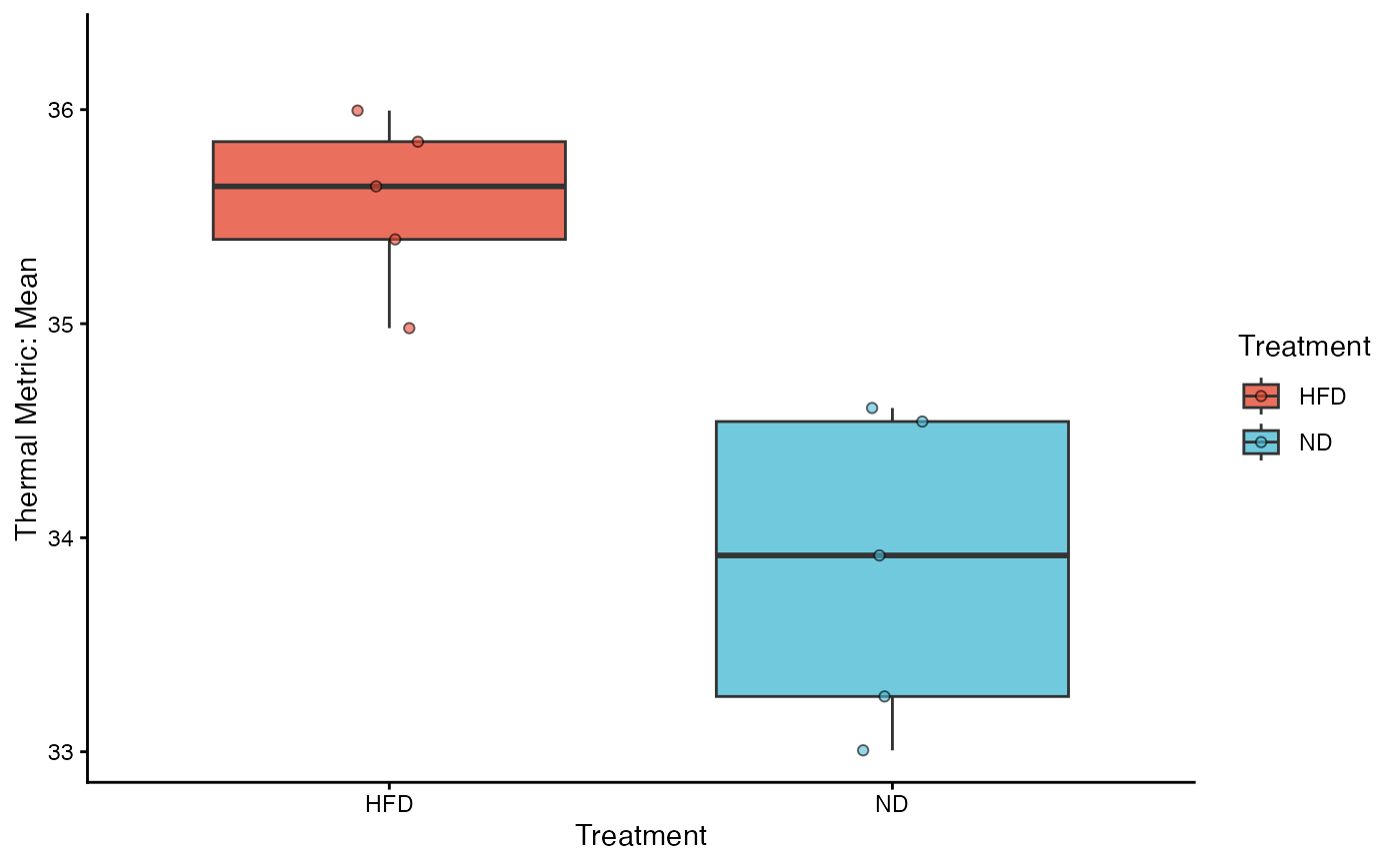
Creates a high-quality box-and-whisker plot to visualize the distribution of thermal metrics across groups. This function is ideal for displaying median values, quartiles, and range, while optionally overlaying individual data points to reveal the underlying sample distribution.
Usage
viz_thermal_boxplot(
  data,
  y_var,
  x_var,
  fill_var = NULL,
  add_points = TRUE,
  point_size = 1.5,
  point_alpha = 0.6,
  palette = "npg"
)
Arguments
- data
Data frame. The merged dataset (e.g., output from
aggregate_replicates).- y_var
String. The name of the numeric column to plot (e.g., "Max", "Mean").
- x_var
String. The name of the categorical column for the X-axis groupings.
- fill_var
String. The name of the variable used for fill colors. Default is
NULL, which usesx_var.- add_points
Logical. If
TRUE(default), overlays individual data points usinggeom_jitter. Highly recommended to show sample size and distribution density.- point_size
Numeric. The size of the individual jitter points. Default is 1.5.
- point_alpha
Numeric. The transparency of the jitter points (0 to 1). Default is 0.6.
- palette
String or Vector.
If a string: Pre-defined scientific palettes (
"npg","jco").If a character vector: A custom list of hex codes.
Value
A ggplot object. Can be further customized with standard ggplot2 functions (e.g., + ylim(20, 40)).
Details
This function includes several automated optimizations for scientific reporting:
Smart Outlier Handling: If
add_pointsisTRUE, the function automatically hides the standard boxplot outliers (outlier.shape = NA) to avoid plotting the same data point twice (once as an outlier, once as a jittered point).Palette Expansion: Like the barplot function, it automatically interpolates colors if the number of experimental groups exceeds the palette's limit.
Layout: Uses
theme_classic()for a clean, academic look.
